Category Archives: Design

- Blogging Dangerously Website
A smary blog site that is sure to make you blush at times. Overall great blog site design. Simple and pleasing color palette. It is not overly busy and is easy to maneuver.

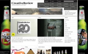
Creative Review Website
A great design website full of lots of design ideas and information. Very nice layout and set up of the page. Simple and very easy to use.

Design Observer Website
A wonderful site full of inspiration and ideas. The layout of the website is clean and well organized. It’s easy to manuever through and keeps the viewers intrest.

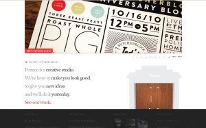
Fuzzco Website
One of my all time favorite websites. I would love to work here someday. I think the site is full of wimsy and character. It is easy to manuever through and the way that it is designed it makes you want to look at the next page and then the next. Great layout and design!

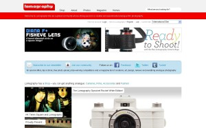
Lomography Website
One of my favorite sites to explore. I want to purchase everything. I think using the old school video game font really adds to the look and feel of the site. The bright use of colors also plays along with the fact most of the items on there are toy cameras. Even the style of font for the logo works wonderfully.
2 Comments | tags: blogging dangerously, creative review, design, design observer, fuzzco, links, lomography, web design | posted in Design, Internet, Library List
My Review of The Converse Website

Converse
The Converse Official Site is just a really fun well designed site. The theme of the site changes according to the color on the color wheel that the visitor chooses. It looks like a scrape book with various photographs on it and hand drawn illustrations. The background and navigation are all just a basic black and white design but the product graphics bring color and life to the page. All of the graphics are also movable and when clicked brink the information to the front of the screen. I think the font and style choices seem to follow along with the overall theme of the site.
Of course I may be a slight bit bias being they are my favorite shoe!
Leave a comment | tags: color, converse, design, graphics, shoes, web design | posted in Design, Internet, Website Reviews
Animated Scroll To Top – Tutorial

Source for Picture Blogger Tune Up
- I actually found this tutorial to be extremely helpful and easy. At least I am hoping that it is easy. I would love to try this out on a site design. The tutorial by Web Designer Wall shows you how to insert code and jquery to get a cool animated effect when you scroll down the page a graphic fades in that when clicked returns you to the top of the page. It is a very slick idea and well executed.
Leave a comment | tags: animated, scroll, to top, tutorial | posted in Design, Internet, Journal Entries
Pretty Sketchy

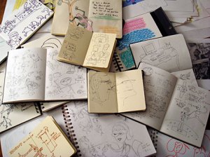
Picture Source PaMdora's
- This is actually a topic I have been thinking a lot about myself lately. I love buying sketchbooks and buying the pencils and pens for my sketchbook and then I don’t actually use them because I am to afraid what I put in there is going to suck. I know it is for my benefit and its not going to get published or hung on the wall of an art gallery…. but somehow if I am going to keep this artistic journal I want it to be a damn good one lol. I am going to just open that first page and whether it is good or not I am going to put pencil to paper and start creating lines! In the blog article Jason Santa Maria basically states the same thing. It is as much an expression of artistic ability as it expresses that you think. It is simply an outlet for ideas and I know I get a few of those from time to time.
2 Comments | tags: design, sketch, sketchbook, thinking | posted in Design, Internet, Journal Entries
The Elements of Content Strategy

In the article “The Elements of Content Strategy” by Jason Santa Maria, he was looking at the common occurrence of web designers and bloggers everywhere. He was discussing the habit of putting so much emphasis on the design of a page and the graphics on a page, that there is a complete lack of focusing on the content. I completely agree with him on this subject matter. I think more attention needs to be. There are flashy pages all over the web but what keeps a viewer returning to your page is the actual content. If you don’t have that you don’t have visitors!
Leave a comment | tags: content, graphics, jason santa maria, web design | posted in Design, Internet, Journal Entries
My Review of Awesome – JavaScript

Awesome - JavaScript
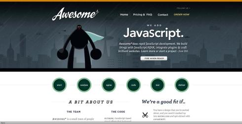
The Awesome – JavaScript website has a fun cartoon or comic book feel. It kind of appeals to the computer nerd. I like the simple black, white, and gray color scheme with just that pop of teal as an accent. The script font for the logo works with the cartoon superhero but is will accentuated with the more modern font for the rest of the page. The layout for the page is clean and easy to navigate with the buttons along the middle. When you mouse over the navigation you get a pop up bubble that tells you about what content that button will take you to.
Leave a comment | tags: awesome, websites | posted in Design, Internet, Website Reviews
My Review of Florence and the Machines Website

Florence and the Machines
The Florence and the Machine website is just a fun website design. It is for the band Florence and the Machines of course and it doesn’t look like your average band or music website. It has a kind of eclectic old feeling to it. It has roses and plastic lungs and butterflies…. just an odd assortment of oddities. The overall feel of the site though is very well done! I love the dark muted graphics, the wood grain background, and the vintage looking photographs. I think that the colors and font choices really reflect the overall theme of the site and the movements and sounds that continually run also add the viewers experience.
Leave a comment | tags: bands, florence and the machines, music, web design | posted in Design, Internet, Music, Website Reviews
My Review of SCAD Website Design

SCAD - Savannah College of Art and Design Website
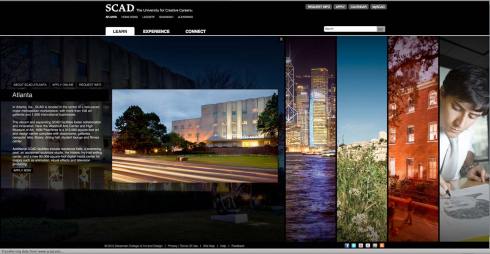
The SCAD website to me is everything a website should be. It utilizes clean and simple design, making it easy to navigate and explore. I love the black background and the way that the images fade into the black background but you have a punch of color with the pictures that acts as a navigation system. I think that the way the pictures slide to reveal the larger image is a really cool idea visually. It lets the user participate in the website experience in a fun and creative way. I think the simple text and modern font compliment the overall feel of the site. For an academic site that is trying to get potential designers to attend their school they have done an excellent job of showing what their school has to offer.
Leave a comment | tags: art, college, design, graphics, savannah, SCAD, web design | posted in Design, Internet, Website Reviews
Don’t Be Afraid to Change Focus

Change is Good!
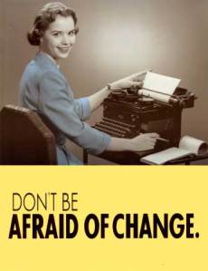
An interesting blog by Brandon Eley on Site Point. As a business you can’t be afraid to seriously look at your business and move in the directions your clients and competitors are going. Being static and refusing to change will get you know where but obsolete. I think even as a designer you must live by this motto. If you continually stick with one type of design or a certain way of doing things you will find that fewer and fewer people are going to be using you as a designer and being interested in your work. Trends and focus are continually changing and sometimes its bad and other times it is good. I have rarely every found a situation where change was a bad thing. What about you…. do you fear change?
Leave a comment | tags: change, change is good, design, focus, life, redirection | posted in Design, Internet, Journal Entries, Lifestyle
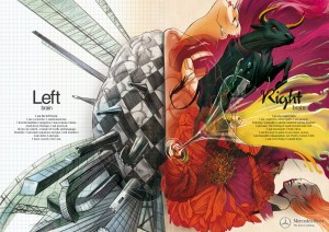
Mercedes Benz -Left Brain VS. Right Brain Advertising

Mercedes Benz Ad - Left Brain Right Brain - Music

Mercedes Benz Left Brain Right Brain Ad - Passion
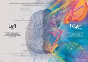
I came across a blog on Fuel Your Creativity discussing the new Mercedes Benz ad which shows a series of different left brain right brain designs. One showing a music design, one showing a beautiful painting design, and one design that is supposed to show passion. I think the overall ad is quite gorgeous, beautiful illustrations and stunning detail but I was lost on how it was supposed to represent Mercedes Benz. You don’t even get a glimpse of thier car designs in the ad, in fact there isn’t even a car in the entire ad series. So how does this represent a car company? I guess it could be a stretch where the ad is only showing the minds and thought patterns of their drivers, but it certainly doesn’t make me want to go out and purchase a new car. What do you think?
Leave a comment | tags: ad, benz, design, left brain, mercedes, mercedes benz, right brain | posted in Design, Internet, Journal Entries


